how we found our invites
My mother taught me from a very young age to appreciate card stock. Whenever a particularly fancy wedding invitation would arrive on our doorstep, she would nod approvingly if the thickness of the invite was sturdy enough to double as a doorstop. For better or for worse (see my wedding joke?), I seem to have inherited her love of beautiful stationery. While this means everyone attending our big fete will not be receiving an e-mail invite, it also means I had to temper my love of the well, finer things in life with the cold, hard reality of the value of a dollar. For example, I now know that sending shiba inu puppies to 300 people as a save-the-date is not the most financially prudent decision. BUT! Pound puppies are much, much cheaper.
So how does an aesthete on a budget find her Louvre-worthy stationery? When I started looking for my own invites, I didn't have much of an idea of what our finished product would look like. There is an embarrassment of riches in New York City when it comes to stationery designers. This is wonderful in the sense that you're able to see hundreds of different styles, most of them all unique and beautiful. But narrowing down your favorites to the absolute perfect invite can be tricky. Like many other cataracts of the Nile in wedding planning, my advice is just to flood your senses with many different styles and see which ones you find yourself drawn to more than once.
For me, I knew I wanted something more or less traditional size- and shape-wise and I adored the idea of a cartouche (I could pretend and say I knew what this meant before I started wedding planning, but... no) with our initials in it. Then I scoured websites, went and visited printers and -- of course -- Pinterested like there was no tomorrow.
Once again, my launch pad was New York Magazine. They have a great group of stationers and you'll be able to get a feel for their style on their websites before you start your in-person visits. Once I exhausted that list, I decided on four places to explore further: Ceci, Mr. Boddington, Swayspace and Village Invites. I can't recommend making appointments enough. Seeing and touching an invitation is very different than ogling it on a computer screen. Plus, you'll be working with this team for your save the dates, your invites and, if you so choose, lots of other pieces like your thank you notes, your menu and your place cards. No one wants Regina George designing their stationery. You want Ryan Gossling designing your stationery. Or, at least, holding your hand through the process.
 |
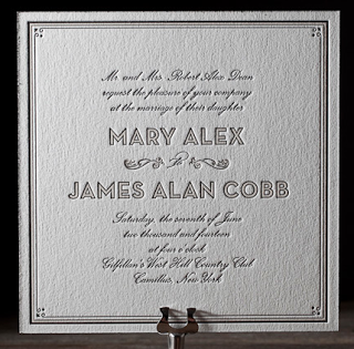
| An adorable Bella Figura invite |
For those of you still looking, I recommend all four of these shops. We ultimately decided on Village Invites because of cost and location. It's two blocks from our apartment and they carry Bella Figura which are really stunning pieces without being totally haute-couture invites. And yes, that is a real term from the world of wedding invite land. Nuptialistan.
 |
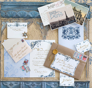
| Ceci's custom Parisian-themed invites. NBD. |
If you're looking to break the bank, if you really want true haute-couture invites, then, seriously, look no further than Ceci. Want to send your guests a bottle of Châteauneuf-du-Pape as your save the date? They can do that. They can also create custom maps, jigsaw puzzles or turn water into wine. However, in a rare moment of self-reflection, I realized that these contraptions weren't entirely necessary for our own event. Maybe for our vow renewals in Capri.
 |
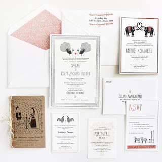
| Mr. Boddington's with a splash of elephant. |
Mr. Boddington does really lovely work and everyone that works there is a gem. They create very whimsical designs and each one is done from scratch for each bride, which is a great touch.
 |
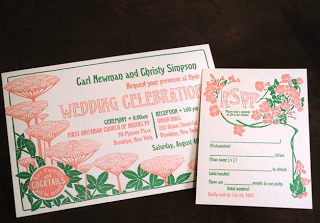
| Old-school feel with Swayspace's invites |
Swayspace has a bit more of a hipster, Brooklyn-feel (they are in Gowanus, after all) and honestly, it was just too far a trek to get out there to make it reasonable to hire them. If you visit however, please don't return to Manhattan without picking up a slice of salty honey pie from Four and Twenty Blackbirds.
Insider tip: the more intricate, the more you pay. This seems pretty intuitive, but intuition can sometimes go out the window when you see how pretty envelope liners look. A few elements to keep in mind:
Offset vs letterpress printing: Offset printing is MUCH cheaper. If you don't really care about having those raised letters that are a hallmark of classic wedding invites, this is a great way to save some dough.
One color vs two ... or three: Each time the printer adds a color to your invites, that's an extra bit of work for him or her. To save time and expense, pick your favorite color (my vote is for gray or black) and make the invites beautiful through a pretty design.
Card stock: Yup, just like my mother says, the thicker the card stock, the more you'll pay. The good news is that most printers' standard paper for wedding invites is already thick enough.
As for our save the dates and wedding invites? They're still a work in progress, but check back here for sample images later on...
