how we made our seating charts
 |
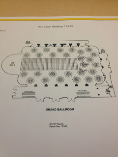
| ROAR, says the floor plan. |
Honestly, if I never see or speak the words "seating chart" again it will be too soon. Maybe for the duration of this post we should just refer to it as Voldemort.
[Get it? Because people called him He Who Must Not Be Named?]
Figuring out where your guests are sitting is annoying.
If we didn't have as large of a guest list, maybe we could have gotten away with open seating, but then Stacey would have come late to her table and there wouldn't have been any more seats and that would have been sad.
I know only about 5 people are going to get that joke, but I don't care. Also, they are all my bridesmaids.
Here is why seating your guests is annoying, in no particular order: not all groups of family or friends fit snugly into groups of 10 (or however big your tables might be), there will always be certain family members or friends that can't be at the same table (unless you're going for a Real Housewives of New Jersey season one finale moment. Then, with all due respect, seat as you wish.), and there will always be a few people left over who don't know anyone and you will have to seat them with your crazy cousins from Guatemala/Ukraine/Turks and Caicos.
Also, there will be people that don't RSVP on time, people that have to drop out last minute, friends that get last minute bids to be on the next season of The Bachelor, and so on and so forth.
The bottom line? It's going to be a messy process that won't begin or end when you originally planned, so put on your big girl pants and deal with it. In the grand scheme of wedding planning (and that is a large scheme, friends, as we know), it's a few hours of your life and you'll emerge from this abyss with a wonderful feeling of accomplishment.
And! Good news: we live in the 21st century and the internet is super helpful with organizing your reception (also, buying astronaut ice cream in bulk). If I had known WeddingWire was so stupendous for managing guest lists, we may have eschewed our Excel charts all together. Well, probably not because Mike loves geeking out with them ("Hey babe, want to see something cool with column formatting?!"), but even he agrees that the WeddingWire platform is really user-friendly.
I highly encourage all you other brides-to-be to set up a profile on the site to check it out for yourself, but the tool I found to be the most useful is their seating chart. You can upload your whole guest list from email addresses or Excel and then draw a reception space that's the exact length and width of your actual, physical room. From there it's easy enough to place tables (Tip: I suggest asking your venue for a floor plan so you know if there are any columns to avoid or where the dance floor will be placed), populate them with guests and maybe play matchmaker with some of your single friends and family.
You won't be done in no time, as, stated above, this process is a pain in the ass, BUT it will make the ordeal far less strenuous and you won't forget or double count anyone. Genius.